Website design: Creating the Perfect Homepage

There are many thousands of primary and elementary schools out there for parents to consider. In many cases, your website is the only chance you get to show parents why they should choose you over your competition.
While having a beautiful website is often desirable, I think I speak for every Montessorian when I say that I would choose an effective and highly converting website that grows my school over a pretty website any day.
I'm happy to tell you that this is actually quite simple to do if you're willing to make a few changes. Let's walk through 4 changes you can make right now that will increase your conversions and engagement with your website.
#1 - Place your primary call to action above the fold
Ask yourself this question: “What action do I want my website visitors to take?”
This is such a simple question, but vitally important. You must know what action you want your website visitors to take and you must ask them to do it.
This can be as simple as “Request Information” or “Schedule a Tour”, but the point is that it has to be on your site. If you don’t give visitors an option to take action and make them dig for it instead, you’re losing more qualified parents than you think.
Once you decide on your primary “Call to Action” (CTA), you need to place it front and center on your website. This is usually in the form of a button just below your opening headline or up in the top right-hand corner (pro tip: do both).
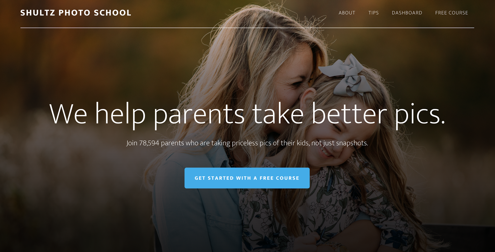
https://shultzphotoschool.com/
Looking at the image above, it's obvious what action I should take as a website visitor. It’s a perfect example of not only the CTA button but another crucial element of your homepage.
#2 - Clarify your message into 2 sentences
A visitor on your website must immediately know what you are and why you matter to them. If they cannot answer that question within five seconds without scrolling, their brains are telling them to move on.
Let's try an experiment: Do a Google search for “Montessori schools” and click on any option.
Chances are, you’re going to see clutter, long explanations of the story of the school, and a lot of information competing for your attention. If the goal is to confuse and lose prospective parents then this is definitely the way to go, but if you want visitors to instantly know what you do and why you’re different, you need to clarify your message.
It is simple, you need two things:
- A main headline that literally says what you do.
- A sub-headline that says how you’re going to make the visitor’s life better.
Example: We help parents take better pictures. Join 78,594 parents who are taking priceless pics of their kids, not just snapshots. (emphasis mine)
Example 2: We educate children for life, not just tests. Learn how the Montessori educational method develops responsible, focused, and powerful children.
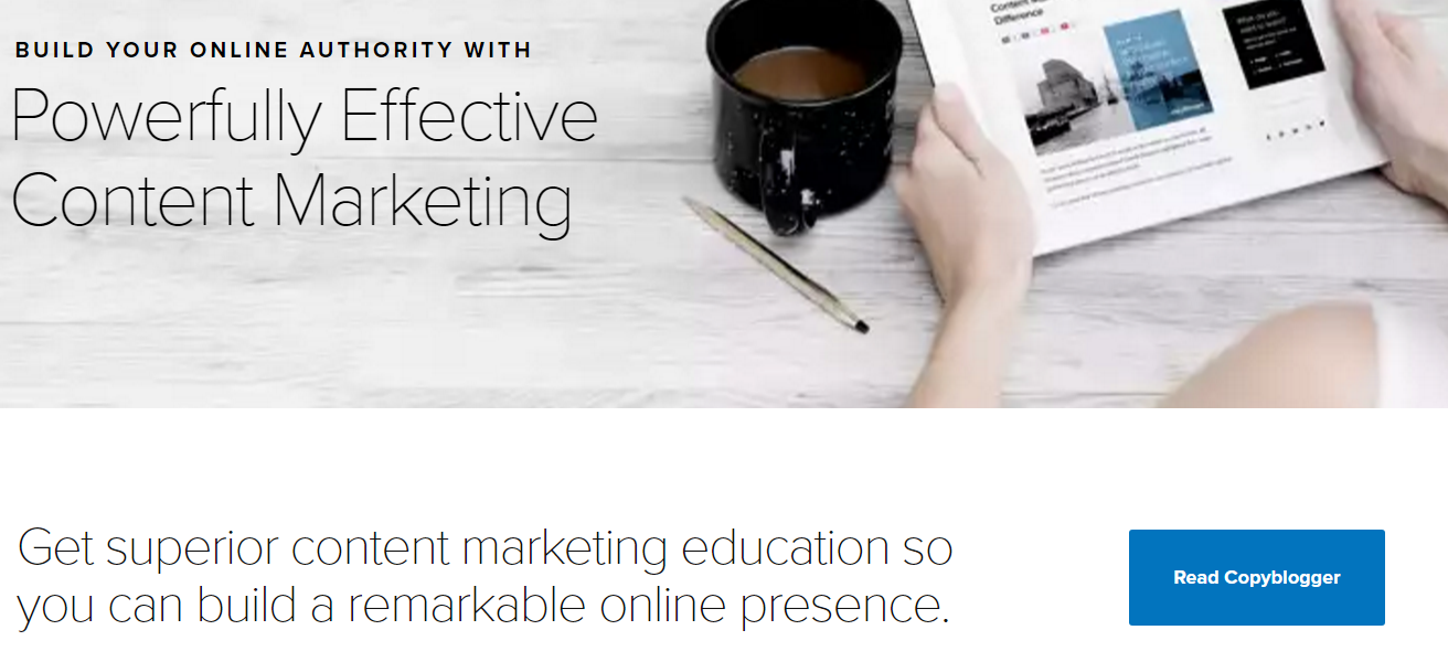
Here’s another example from Copyblogger:
This will most likely take a few tries, but when you nail it, it should be the first and only thing your visitor sees when they first come to your page. Be sure and take note of your analytics before and after you make this change. My bet is you’ll see a noticeable uptick in engagement and conversion (your visitors taking the action you want them to take).
#3 - Get real testimonials and feature them right up front
Social proof is easily one of the most powerful reasons people take action. Think of Amazon, Yelp, TripAdvisor. Their active community of reviewers is what makes them standout among their peers.
The key here is to showcase testimonials that are genuine and from real people that can relate to your website visitor. Nothing you can say will be as powerful as someone who has experience what you have to offer and raves about it (pro tip: place another CTA button right underneath the testimonials).
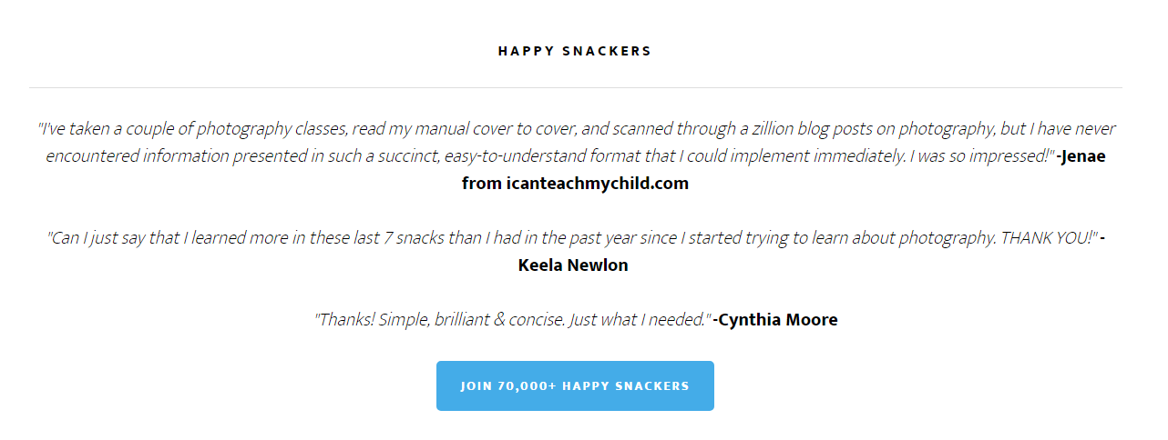
The placement for these is important as well. They should be close to the top of your homepage, ideally in the second or third section.
#4 - Showcase high quality “success” images of your own school
As you know, there's nothing more powerful to a prospective parent than watching a Montessori classroom in progress. The concentration in the children, the progress they make, and the obvious effectiveness of the method are more powerful than anything a parent can read online. You need to showcase that on your website.
Take photos of your children working (if you have permission, of course). Show parents what they can expect to see, what life inside your Montessori school looks like and what is possible for their child.
Many schools have the exterior of their school as their main website image, or maybe some kind of inanimate object, like a flower or toy. However, these don't communicate the benefits of Montessori to your website visitors. A child actively learning in the unique environment of Montessori does.
I've given you four ways to increase engagement with your website. The next logical question is: how do we get more people to your website?
The answer is complex. There are so many effective and ineffective ways to market your school online, and they're constantly changing. We've created an online community focused solely on sharing the latest and greatest marketing knowledge for Montessori schools. Join over 80 schools in our mission to grow Montessori education around the world through marketing. Sign up for free.
0 comments
Leave a comment