How To Make Your Website Your Star Admissions Assistant | Part 1: Your Homepage
Imagine your perfect admissions assistant. What would she be like? She’d consistently offer a great first impression of your school. She’d be friendly, intelligent, professional, organized, and hardworking. She would answer questions, educate prospective parents, take messages, provide tuition information, and schedule tours based on your availability. All without any direct supervision from you.
The perfect employee, right? Even better, now imagine this assistant worked tirelessly 24 hours a day, 7 days a week.
I’ve just described what every Montessori School website can and should be!
The truth is, many websites fall short of this potential. Why? The number one reason is a homepage that doesn’t deliver results. Here’s how to make sure it does.
Anticipate parents’ needs and questions.
While your website is clearly about your school, it should focus on prospective parents. Put yourself in their shoes. Many don’t yet know about the many benefits of Montessori. They are just looking for the best school for their child. What questions would they ask?
- Does this school have a program for my child?
- What is Montessori?
- How do I apply for my child?
- Where is the school located?
- What do other parents think about this school?
- How can I find out more?
I know this seems like an overwhelming amount of information to include on one page, but the trick is to break down each of these elements into manageable chunks. Here’s how:
Clearly state who you are.
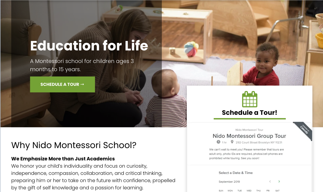
You need a clear message so that your prospective parents know exactly who you are. If a parent has to stop and try to figure out what you offer, you’re likely to lose them within the first few seconds of landing on your website. There’s no need to get fussy with clever quotes or sayings. Simply “A Montessori School for Children Ages 3 to 12” is perfect. Clear over clever wins every time.
Include a Schedule a Tour button that can’t be missed.
No doubt you’ve heard us beat this drum, but it can’t be emphasized enough. The purpose of your website is to encourage the visitor to take the next step. In most cases, this is to schedule a tour.
Imagine you’ve wandered into a store and it turned out to be a lot more interesting than you anticipated. You get really excited that this place has a lot of what you’re looking for. You make a decision to purchase an item and look around for the cash register. You’re excited and ready to take this home! And... the register is nowhere to be found.
Your Schedule a Tour button is your cash register. Don’t hide it! It allows your visitors to take action when they’re excited and ready. The ability to nail down a date and time and have it confirmed on their calendar - right away - is invaluable.
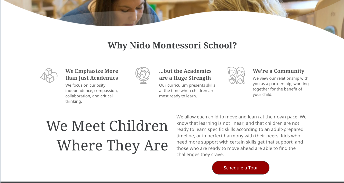
Explain a few important differences about Montessori education.
We could go on and on about the benefits of Montessori education, but doing this on your homepage risks overloading a parent with too much information before they’re ready. Instead, pique their interest by choosing 3 or 4 main distinctions about Montessori and include those on your homepage. It’s important to share with prospective parents the advantages of Montessori over other schools, as they’ll likely be comparing their options side-by-side. If they’re interested, they’ll dive further into your site to find out more.
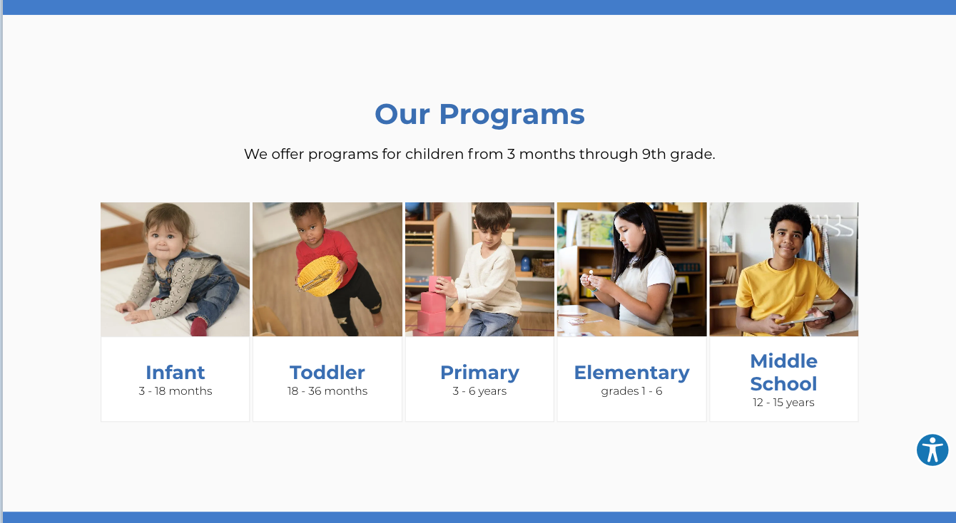
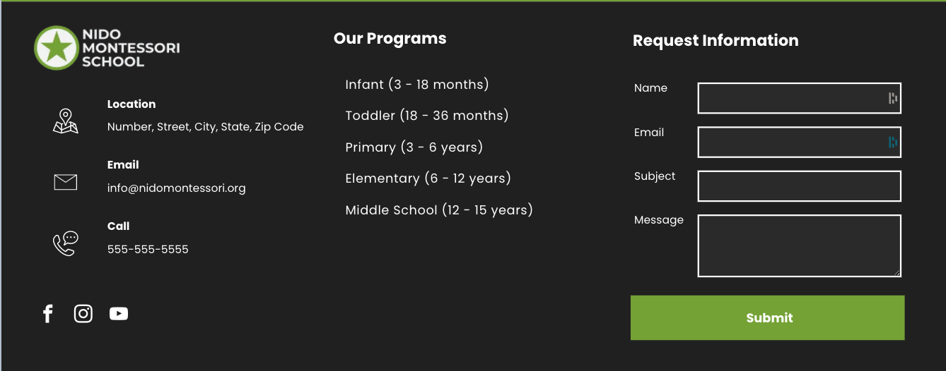
Identify your programs.
On your homepage, you should lay out your programs in a clear and concise manner. Be sure to include age ranges. Each program should link to a program page with more detailed information. On your homepage, however, it’s important to concisely show your range of programs in one glance.
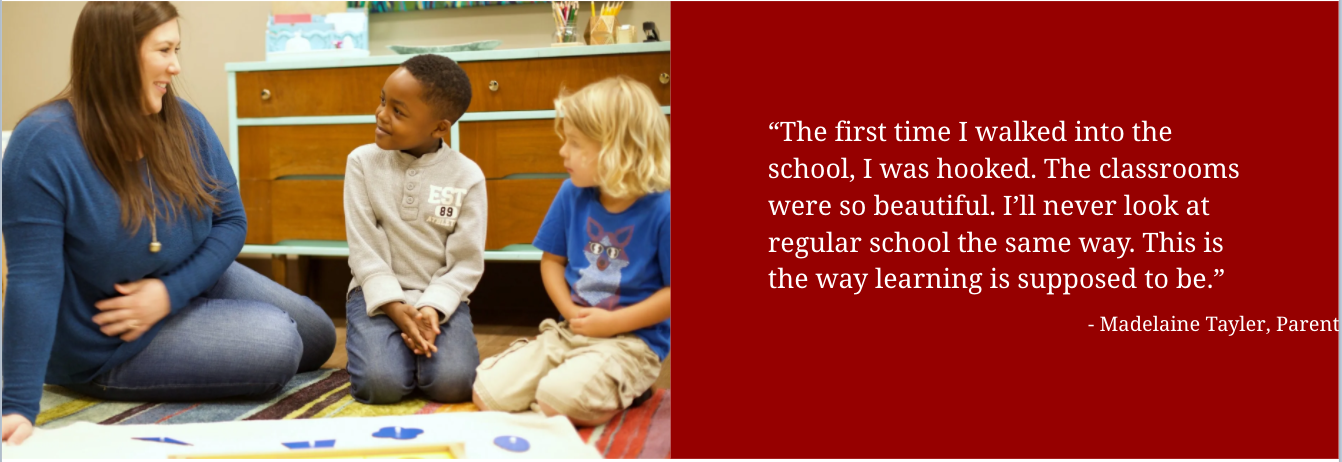
Share a few testimonials.
Social proof is easily one of the most powerful reasons people take action.
People often rely on the opinion of others for validation, and this is especially true of parents who are trying to choose the best school for their child. The key for your Montessori school is to showcase positive feedback and testimonials that are reassuring to the parents visiting your site—stories that are genuine and from real people.
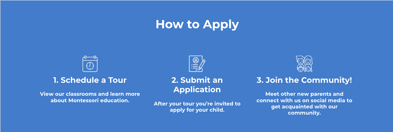
Show a simplified admissions process.
It’s likely that there are several steps in your admissions process, but don’t overwhelm a prospective parent with all of the details upfront. Distill your process into 3 steps that can be easily understood, so that the admissions process feels manageable and it’s very clear what that first step is.
Offer multiple ways to engage.
Some visitors might not be ready to schedule a tour right away. Provide other ways for visitors to engage with you. Offer your tuition rates or a white paper as a download in exchange for completing a short form. Be sure your phone number, email, and physical address are easy to find in the footer of your site.
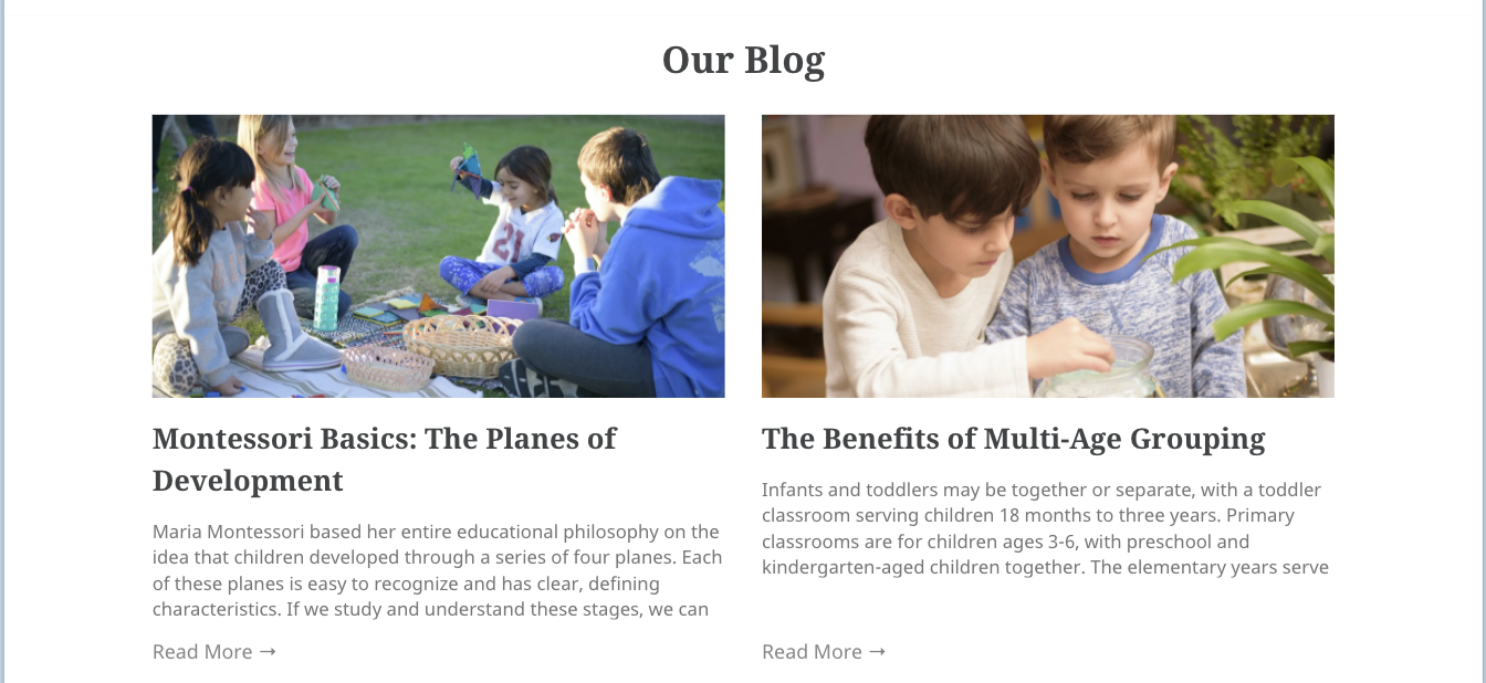
Show your most recent blog articles.
An active blog is one of the most critical pieces of your online marketing strategy—I’ll get into that more in my next article! On your homepage, your blog can help you stand out as a thought leader in the Montessori community. A current blog reflects a vibrant school. But it only works if you keep your blog content fresh! Strive for a new article every week. If this seems daunting, consider our Content Plan which includes a weekly blog article written by a Montessorian, in addition to emails, social posts, stock photos, and more!
Be technically sound.
It goes without saying that you don’t want technical issues to get in the way of your visitors’ experience.
Make sure that your website looks good on a smartphone. Mobile devices recently surpassed desktops for internet use, meaning more parents are using their smartphones and tablets when they want to research things like the best school for their kids. That means if your site comes up short in terms of mobile viewing, you could be missing out on a huge opportunity to engage with more potential parents.
Make sure that your website is secure. Seeing that little padlock symbol helps to establish trust and lets parents know their login information, personal data, email address, and other information will be protected.
Make sure that your website is fast. Busy parents aren’t going to want to wait around for a page to load, especially not today when people are used to everything being instantaneous.
Make sure your website is ADA compliant. Provide a fully accessible and optimized user experience for all of your site visitors.
If you incorporate these strategies on your homepage, you’ll be well on your way to ensuring your website becomes your star admissions assistant!
If, however, you got here and now feel queasy thinking about how your website is slacking on the job, don’t panic! That’s what we’re here for.
Nido Marketing offers full-service websites — complete with content — designed to be your very best admissions assistant. Request a marketing plan to find out more!
0 comments
Leave a comment